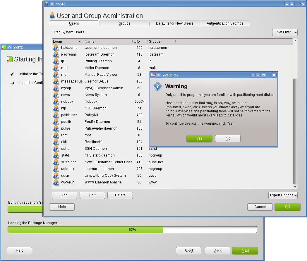
YaST2 got a lot of improvements which will be available in openSUSE 12.1. YaST doesn’t accidentally overwrite configuration files anymore (last bug fixed 😉 ) and snapper provides a rollback function for configuration options, just to mention a few. Therefore it’s time to give YaST2 a new and fresh style. As YaST Qt supports Stylesheets it’s simple to influence YaST’s style.

FACTORY contains the new style already. Packages for older releases are also available in my build service project: http://software.opensuse.org/download.html?project=home:tgoettlicher:Factory&package=branding-openSUSE.
I hope you like it. You can use YaST’s Stylesheet Editor to play around the the stylesheet as described in my this blog post. Please send me improvements you want to share. Thanks.
Both comments and pings are currently closed.
Just, why ? Just because it’s possible ?
Why not just using the currently in use theme so that the experience is seamless and well integrated in the underlying desktop environment ? Don’t you think that’s a much better goal than having fancy green buttons, regardless of how nice they are ?
I have to totally agree with gaboo. What would you say if all the other applications out there would do the same thing? Holy moly!
Honestly, you can’t be serious about that. Maybe you should ask some useability expert – I think I know what he’s gonna say …
At least, could you give us the choice to not use that css thingy?
Of course you can use an empty css on your machine if you don’t care about design.
If something is clear from the past, features nobody anticipates can open unexpected possibilities and interesting use cases. Admittedly not the same field, but who would have seen any use for cameras in mobile phones 10 years ago?
I don’t know how far the Qt Stylesheets support goes, but I wonder whether it would be possible to also have a company logo incorporated in the styles.
Thanks for your improvements of YaST.
Nice, well integrated layouts are very nice. YaST always had a different style compared to the other applications. So more flexibility on this side is great.
Another small thing: You can see it on your screen shot that “OK/Yes” button sometimes is on the left side (like in KDE Software) and sometimes right (like in GNOME). Perhaps you find some time to have a look at this one, too.
Great work.
Thomas
YaST uses the same button order as the current desktop. In KDE it’s [Yes],[No]. Gnome uses [No], [Yes]. Wizards always use [Back], [Next], [Finish]. The users modules from the screenshot uses the layout of a wizard dialog. This leads to this unusual button order.
There was a discussion about the button order in wizard dialogs. See: http://lists.opensuse.org/yast-devel/2011-08/msg00050.html
More details on the button order:
//lizards.opensuse.org/2008/08/28/button-order-in-yast-trying-to-make-peace-with-both-worlds/
This looks great. Is this stylesheet going to be used during installation of openSUSE from DVD too?
Thanks for your comment. There are two different stylesheets, one for the installation and another one for YaST in the running system.
I hope it will all look the same again. I hate it that it looks different in GNOME then it does in KDE already.
It is a pain to tell people where to go when it is different from what you have.
Also dislike the fact that when I click on e.g. Software I still see all the other icons.
And please no two different layouts. One for installation and one for installed systems? Please no.
I would love to see some added functionality during installation. e.g. being able to browse the internet (and look for solutions for install problems) Most of the time the network is already up and running and ssh is possible on console. Having a minimal browser available would be handy and something you can do something with while the system installs itself.
Thanks for your comment and your feature request. Running a browser while installation would cause security risks as the installation runs as user root and system updates aren’t installed at that point in time.
Good work dude! I mentioned this in the 12.1 product highlights (line 111), if you have time, check it… http://ietherpad.com/12-1-release-notes