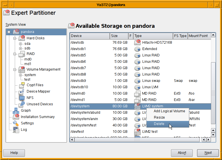
We received some complains that the redesigned partitioner on openSUSE 11.1 is
tedious to use. To remedy these shortcomings I’m adding context menus to the
tables so that it is no longer required to select the correct view using the
navigation tree to perform some operation. Almost all operation should be
available via context menus in the main view listing all devices.

As usual comments are welcome.
Both comments and pings are currently closed.
Great idea, even less clicks per every disk task 🙂 I can’t wait for 11.2:)
how about a separator between different devices to make things clearer? Also indentation of logical drives within extended partitions would be nice.
e.g.
/dev/sda 80Gb Hitachi bla bla
/dev/sda1 80Gb Extended Partition
/dev/sda5 5Gb
/dev/sda6 5Gb
——————————————
/dev/sdb 120Gb Maxtor
/dev/sdb1 2Gb Primary partition
/dev/sdb2 100Gb Primary partition
etc.
Otherwise, for a more complete solution, how about a graphical interface like that of gparted/kde partition manager showing the partitions like this: http://files.fosswire.com/2007/06/gparted_1_big.jpg
Tree views (and deep menu levels) both have the same problem: it is difficult to find something and difficult to get an overall view. I tend to think folders should be virtual and used for grouping (or sets), so you could easily have overlapping folders.
At-the-end-of-the-day, this is an expert tool for those who know what they are doing and want to do it quickly, but with some ‘undo’ functionality.
I can see some value to knowing whats in what, as the previous poster suggests.
Nice, but wrong example. Neither [Add…] nor [Resize] nor [Delete] buttons are present under the dialog thus this functionality should neither appear in the table. The table context menu is an additional menu but should only copy the already present functionality (buttons).
That is intended so. All possible buttons (“Add Partition”, “Add RAID”, “Add Volume Group”, “Add Logical Volume”,
“Add Crypt File”, “Add NFS Share”, “Edit”, “Resize”, “Delete”, “Rescan Disks”, …) would take to much space.
Looks awesome, but I agree that having some seperator between disks, raids, lvms, … and adding some indentation (e.g. indent partitions relative to disks and logical partitions relative to the surounding extended partition) would make it much easier to keep an overview.
I also assume that the context menu doesn’t work only with the top level menu entry but for every single one where it makes sense (e.g. also for single partitions, logical volumes, …), right?
If that is true, all my usability issues with the new partitioner are solved (or at least I can’t remember another one now ;D) and the only thing I`m missing installation wise is supporting installation with an encrypted root file system ( https://features.opensuse.org/305633 ). Please add that for 11.2 since it is pretty much mandatory for laptops (and doesn’t harm on desktops), also openSUSE is one of the last distros not supporting this (further, since all the necessarys software is in place, it should only be a matter of addapting some installation scipt) 🙂
This doesn’t fix the main problem of this design: it is almost impossible to use in the YaST installer, because it can’t be properly resized (try to install 11.1 on a netbook for your fun).
Regards,
Alberto
Katarina Machalkova has addressed that problem by adding a QSplitter in the
installation to allow hiding the installation steps on the left.
But see also https://bugzilla.novell.com/show_bug.cgi?id=482785 :(((
To me, the old Partitioner was just fine. Using the new setup in 11.1 was not an issue though. I really can’t see what all the fuss is about. Except, I suppose if you have a limited understanding in this area – It is a little difficult just to see exactly what you have and where. I agree with @vespas that this: http://files.fosswire.com/2007/06/gparted_1_big.jpg
Is a much better graphical view.
I don’t understand why so many people praise gparted: It has no clue about RAID, LVM, NFS or encryption. Even fstab support is poor.