Because I feel a tad bit guilty about missing all of the Community Week sessions this week (school and work training, and before you ask, I’ve got more training all this weekend, so I can’t make those sessions either), I did decide to do a quick tour of the GNOME Shell, one of the integral parts of the GNOME 3 series, scheduled to be coming out in 2010 or so.
First, big thanks to Vincent Untz for packaging the GNOME Shell packages for openSUSE! I’m using these packages for my testing purposes
Here’s the quick tour:
First, here’s the openSUSE 11.1 desktop w/ GNOME 2.24 running GNOME Shell:
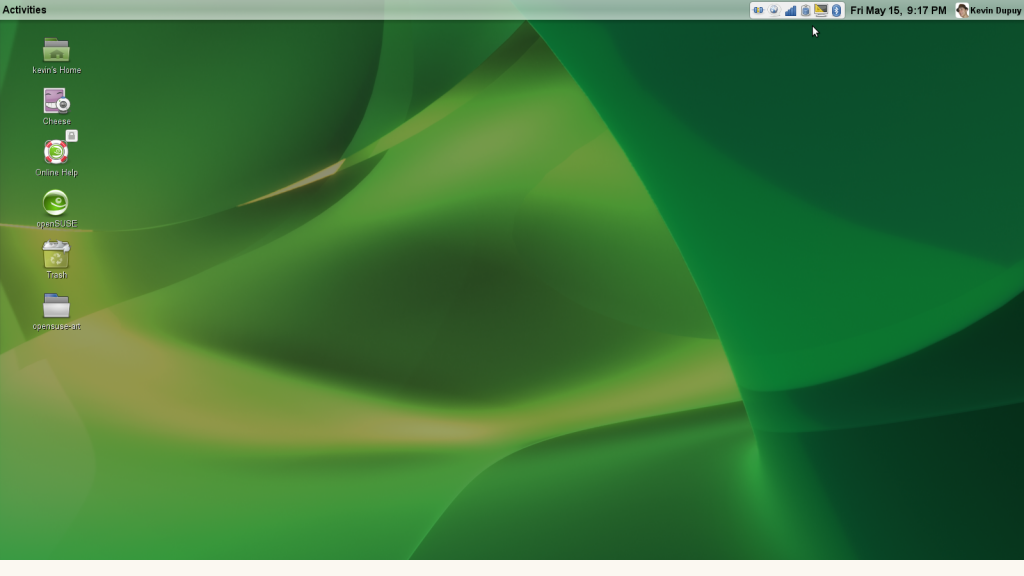
GNOME Shell Desktop
Note the Activity menu and the specially-capulated notification area. Good stuff. I al so like the stylized panel, but I don’t like it at the top. When openSUSE adopts GNOME 3, I’d like to see it moved to the bottom.
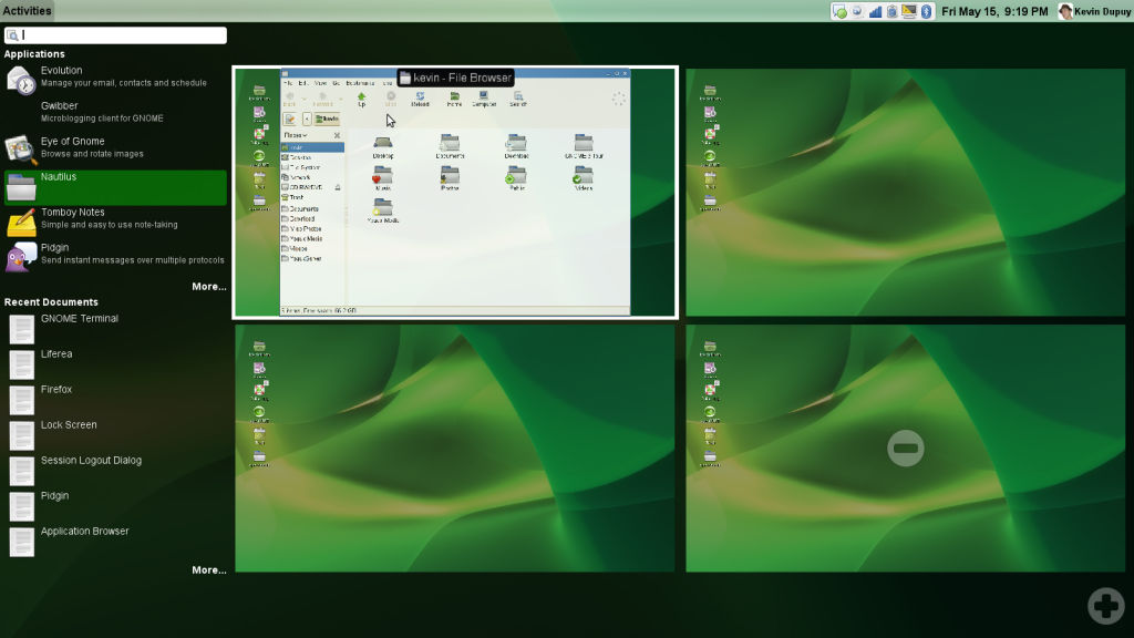
Windows being created from the Application Launcher
Clicking on the Activity menu opens this menu. The desktop shrinks into a side (and you can create or remove as many as you wish, which is seriously awesome), and opens the most recent Applications and documents (I think). If you wish to open an application, double-click or drag the icon onto the desktop you wish it to open to.
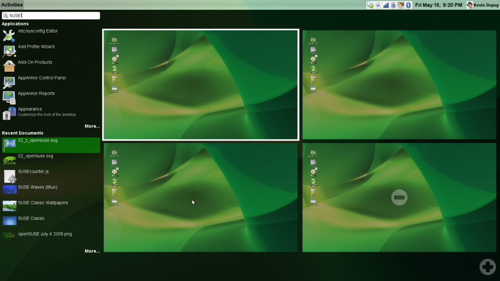
Search
Here I did a simple search for SUSE. Applications and documents that matched that search pop up (although I’m not sure what indexing service that is, I’m relatively sure it’s not Beagle, openSUSE’s desktop search indexer).
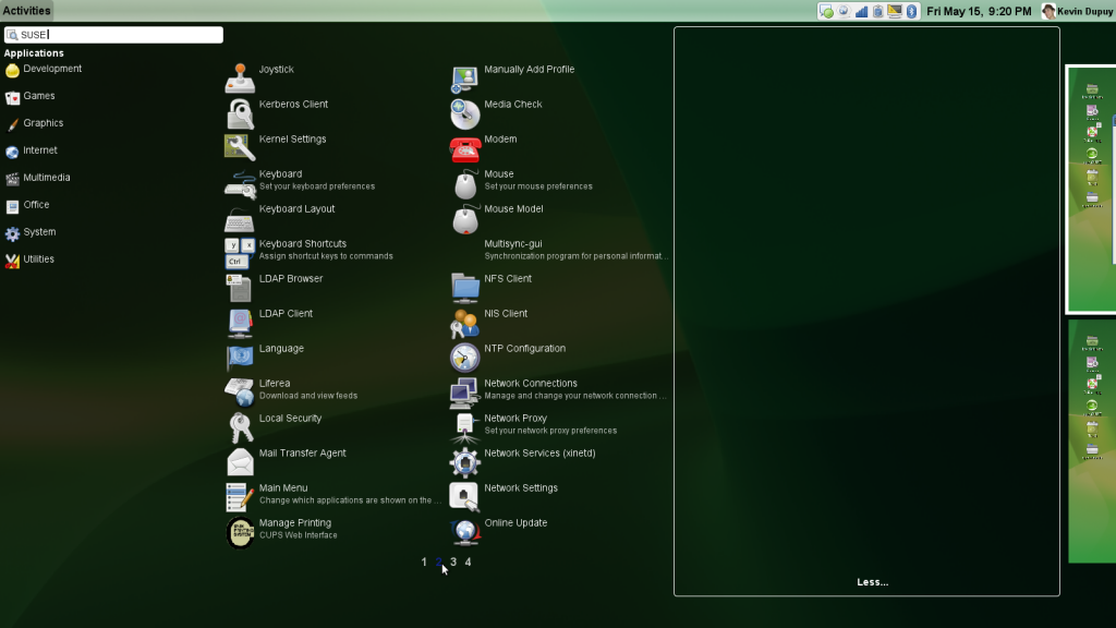
Full search results shown
Here’s an expanded view of the search for apps with SUSE. The desktops slide out of the way, and a multi-column (and page) view pops up. To open, drag an icon over to the right (onto the desktop).
Overall, I like it. Combined with the new stuff coming next year in GNOME 3, this could be quite an interesting release. One of the most important things to note is that this interface seems incredibly tailored toward netbook’s small screens.
What do you think?
Both comments and pings are currently closed.
Wow.. that looks great..
I’m wondering if it works without compositing support — e.g. in a virtual machine — can anybody try – won’t have time to do so for the next few days 🙁
Otherwise it looks like a pretty nice concept.. will need some prove in practice though
No it is not supported in a Virtual machine. There is a not about this on the Gnome Shell website – http://live.gnome.org/GnomeShell#building
“When openSUSE adopts GNOME 3, …”
Hope that adoption won’t include the GNOME Shell Desktop. 😉
I’m not sure about this Gnome shell idea. Basically this is just an uber Application Menu. Do we really need a full-screen menu? Anyways, the search is a nice addition. Good start to replacing the aging gnome menu.
I hope they aren’t going to destroy the desktop like KDE did. I moved to Gnome because of KDE4. I have even tried the latest KDE4, and it just feels “icky”. I can’t settle in to it. If this is the direction Gnome is heading, I will have to switch to XFCE or LXDE. Why do we need this crap? Why??? I still haven’t found one use for any of the junk in KDE4. Just give me a desktop and an application menu, and leave me alone. Our only hope is that this isn’t going to be mandatory like plasma, and we can turn it off or revert it.
Bernhard:
if you install the packages that Vincent packaged, open a console and run “gnome-shell” – it’ll open in a nested window.
And yeah, hopefully someone can run usability tests on it with real people because it does need some work – of course, it’s not in GNOME 3 environment yet, and it’s pretty much pre-alpha at this point.
It’s so disgusting, I don’t like it, I like on gnome simplicity,but this….
I’m quite afraid of it.
I seems that it will be much harder and slower to run any application.
Application menu in Gnome2 is still, doesn’t change much, so I know where the application is and can it start quite quickly.
But Gnome shell? I have to remember the name of app, write some letters, read results, find the appropriate one and run it. Looks like looong way.
It will be nice when Gnome Shell added to current Application menu.
please optimize the nautilus, because are a mostero ram eater, please we need mor speed in our interface :).
gnome rule but dont eat so much ram please.
This is nothing more than a _shiny_ rework of the old interface. I doubt anyone will find anything to say ‘WOW’ over. I think it is a great improvement, it just adds a fluid feel, easier ways to access programs and data; really this is just old GNOME, well maybe a little prettier and a little easier to use.
I really don’t like GNOME Shell. The day this becomes the default interface, I’ll immediately switch to another Desktop Environment.
Gnome shell is terrible and a huge step backwards. It’s a ‘solution’ looking for a ‘problem’. This is just desperate Gnome devs looking to add some ‘excitement’ to Gnome to compete with KDE4, but you can tell they don’t have any real ideas.
It’s a shame they are wasting their time on this nonsense when there is so much that could be fixed in the existing version (including many well documented bugs that go back 6 or 7 years and which STILL have not been fixed even though patched have been provided).
We need to stop pandering to the types of people who can stand to use an interface like this.
This is a terrible interface. As far as I can tell, gnome shell is nothing but a standard application launcher (not unlike KDE’s application launcher). The problem: instead of clicking on an on-screen menu, the user will now have to endure cpu-hogging, desktop reshaping animations (scale + expo!) just to get to the stupid menu. KDE 4 seems like a paragon of engineering elegance compared to this.
There is no UI innovation here: just a bunch of unnecessary “gee-whiz” animations thrown on top of an old-fashioned launcher.