Creating a new (book) layout is both challenging and fun. On the one side you have to observe different parameters like legibility, simplicity, and aesthetic. On the other side, you can play with fonts, margins, styles and all the other great things in typography and design! 🙂
It’s the first time for the Start-Up Guide to get a new layout after some years. The result is the new, so called, pocket layout.
The reason was not that our old layout needed a facelift. As the Start-Up Guide is printed and shipped with the box, it was merely a matter of restrictions by some big German media stores. They wanted a smaller box format and the current box exceeds this size. As the old layout was a bit too wide for the new box format, it has to be corrected.
Lets summerize the prerequisites:
- Page format is 131mm ⨉ 187mm (fixed).
- Total page count must not exceed 230 pages.
- To fit more content in this smaller format, the font size has to be a bit smaller. Another approach is to use condensed fonts (prefered).
- Although not necessarily true (depends on the font), I decided to go with sans serif fonts for legibility reasons.
- Open source fonts are prefered, so it’s easier to build by community members.
After some research, try and error, I settled with these fonts:
- Body text uses DejaVuSansCondensed. This font family has a great variety and is release under a free license (package dejavu).
- Headings use DejaVuSansCondensed too.
- Monospaced text uses MPlus-1m from the M+ Font Family, also available in my repository.
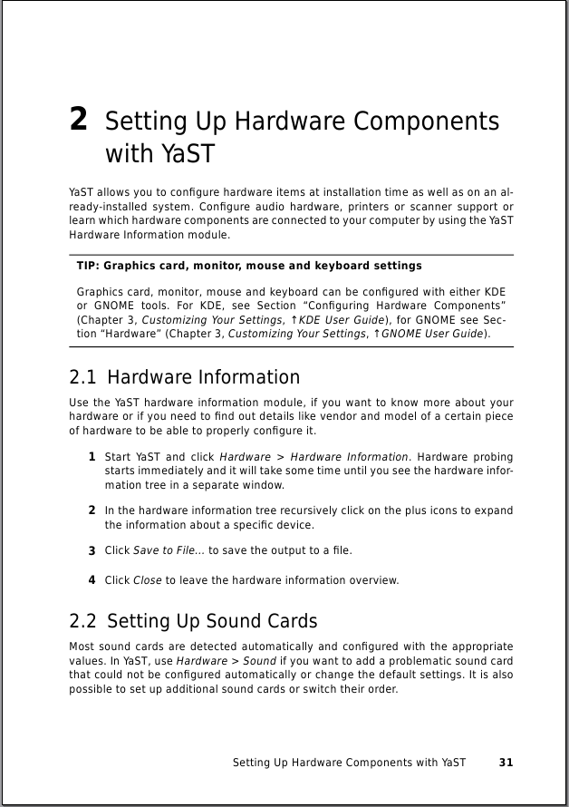
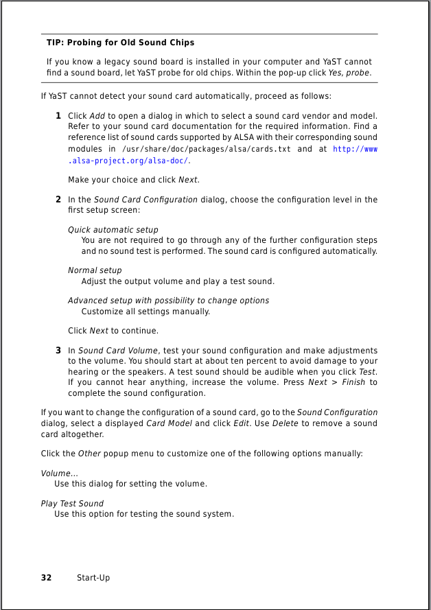
Most design elements are reused from the old layout. Some things has to be changed like chapter/appendix headings, keycaps, text alignment, and indendation to name a few. Get an impression with the following two pictures:

Left side (verso page)

Right side (recto page)
The Start-Up Guide with the new layout is available in milestone 7. Install the package opensuse-startup_en-pdf, filename is file:///usr/share/doc/manual/opensuse-startup_en-pdf/opensuse-startup_en.pdf.
Have fun! 🙂
Both comments and pings are currently closed.