Shortly before the openSUSE Conference, we featured a post about openSUSE statistics. It mostly talked about where we got the numbers, teasing that we’d share the details at the openSUSE Conference. And Alberto did. Today we’ll bring you the numbers Alberto did digested in images and text.
Downloads and users
The simplest statistics for a Linux distribution are of course the numbers of downloads and users, so let’s start there.
ISO downloads
The methodology used to count downloads is easy to understand: we count every IP address that hit the server or is redirected to one of the mirrors, and express the intention to start downloading one of the ISO images available for the distribution. In this way, we count independently every download that uses the same proxy and every different product downloaded by the same IP. We can group the downloads by weeks or by month. In both images we can see that we started counting in 2010 and we covered openSUSE 11.0 to 12.3. Also, in both graphs we can see what events explain the peaks, like the release of the distribution.
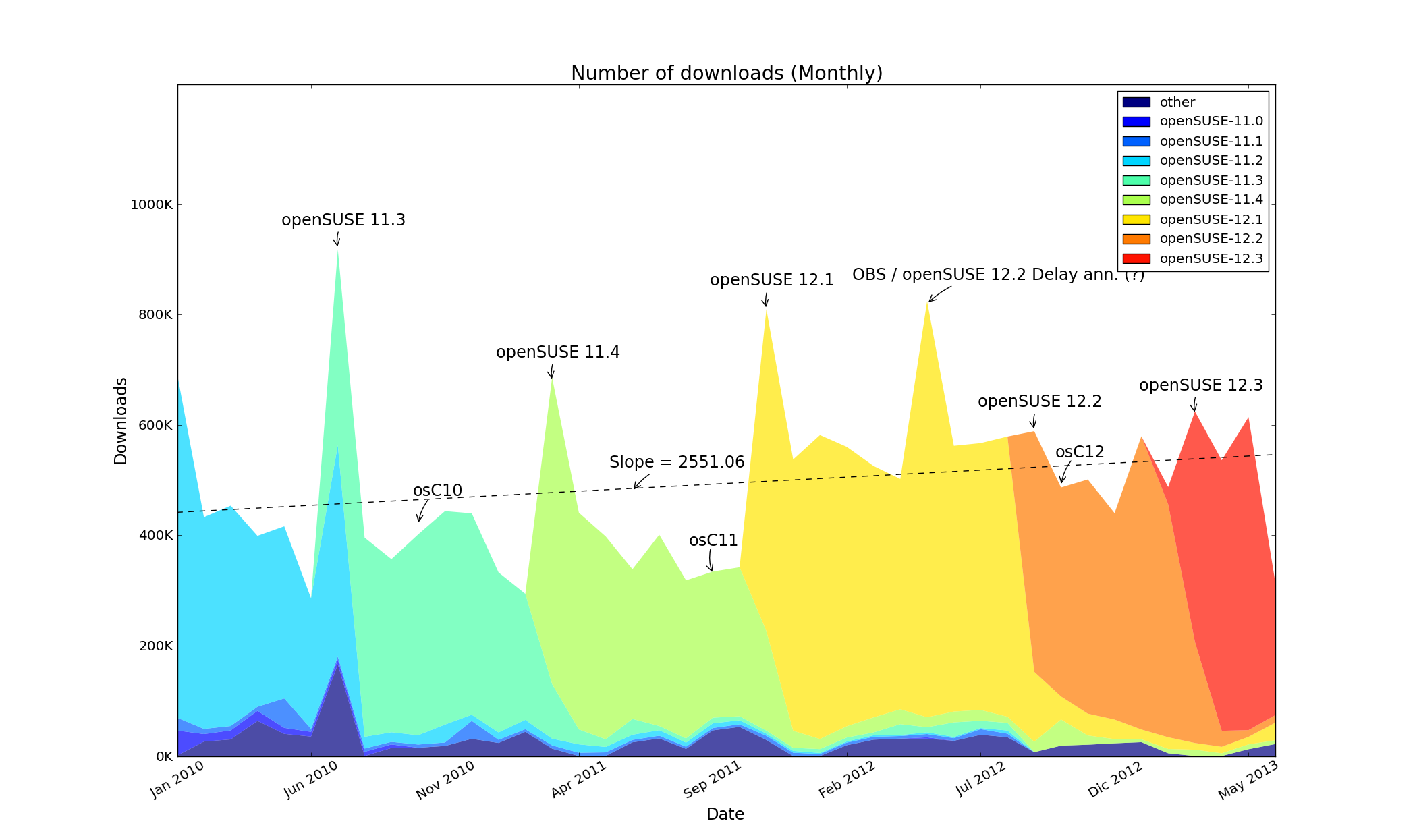
Downloads per month
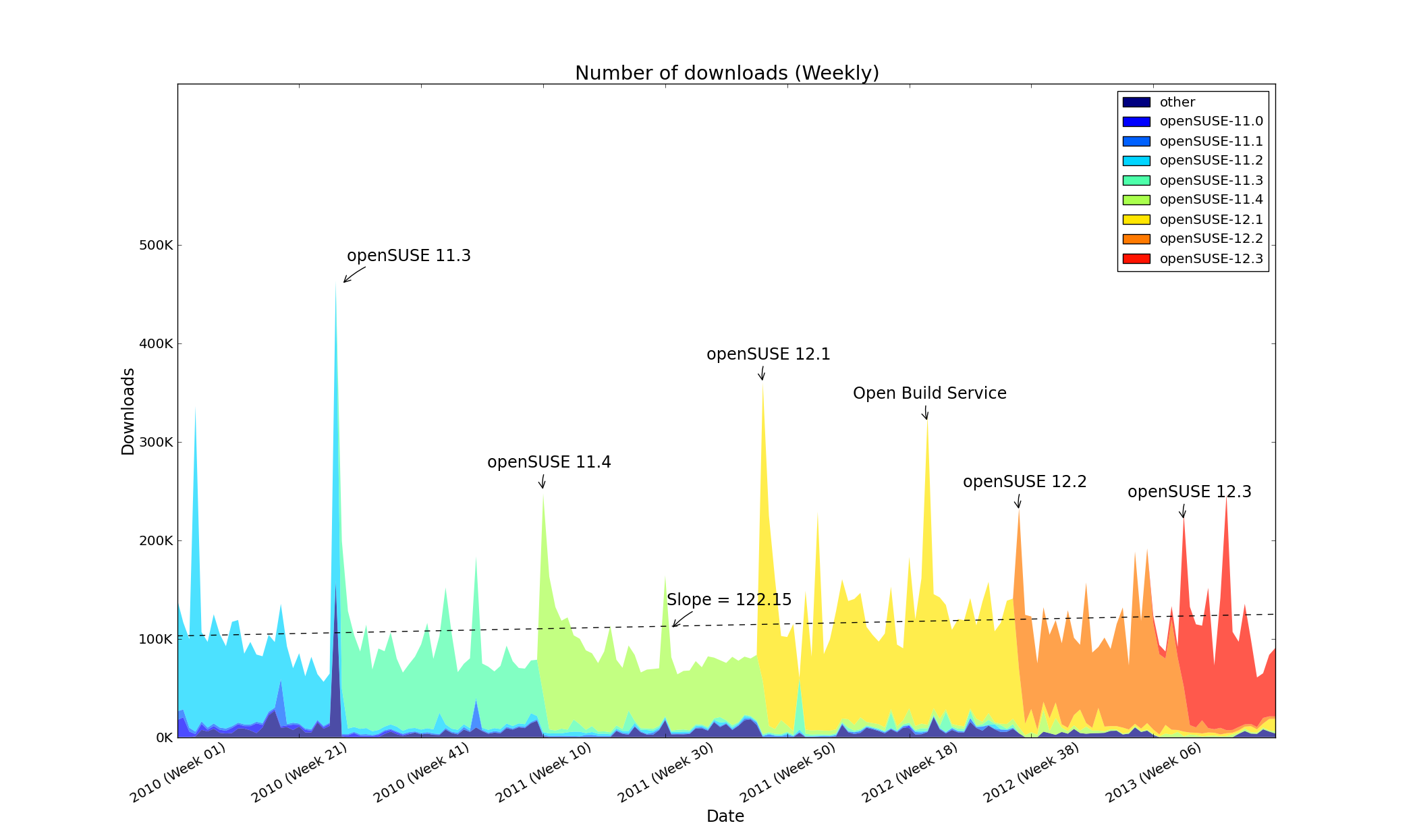
Downloads per week
To make a more detailed analysis we need to concentrate on the monthly graph. For this plot we calculated a linear regression model using the monthly data (41 samples). In the graph you can see a slight growth but decreasing impact of releases. Extrapolating, we can expect about 560K downloads per month in 2014. Note that this is downloads, not installs! Let’s talk about those next.
Installations
To get a more reliable estimation of persistent installations we count systems that regularly update. A count of the encountered unique systems per week or per month is a fair estimator of the number of active installations (see details on the counting).
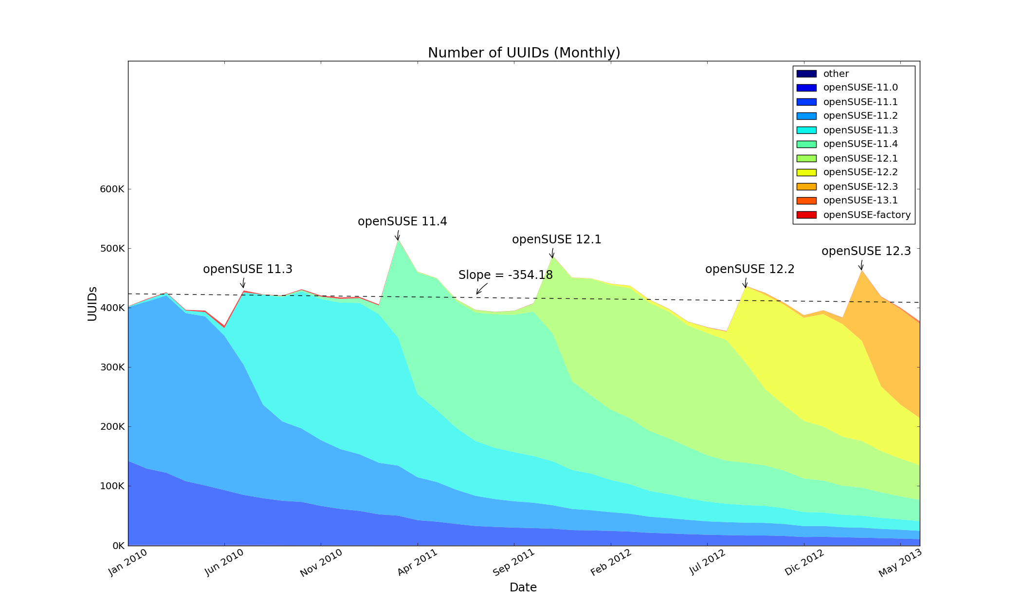
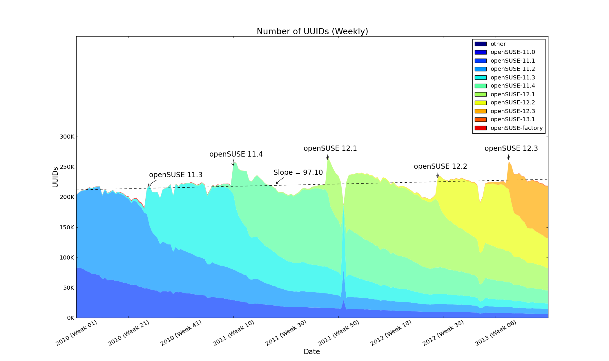
Updates per week
Here you see many interesting things. For example, the red trace on top of the plot in 2010 and 2011 are Factory users. If you look closely, you also see that usage of a particular version already starts before it is out – that is due to testers checking out milestones, Beta and RC versions. And you notice how long it takes some users to move over to new versions of openSUSE – not only has over half of our users not moved to the latest 12.3 yet, but about 140.000 users happily still run releases from before 12.2, most of which (except 11.4) receive no security updates!
When we plot a linear regression model on this data, we see a less encouraging picture compared to the downloads: on average, we lose around 300 users per month. On the size of our installed base this is not huge, but worrying nonetheless.
More data
There are more things that we can learn from the data. We can analyze the behavior of users according to the installation medium or the architecture used and in time we can perhaps analyse how repositories are used and which are popular.
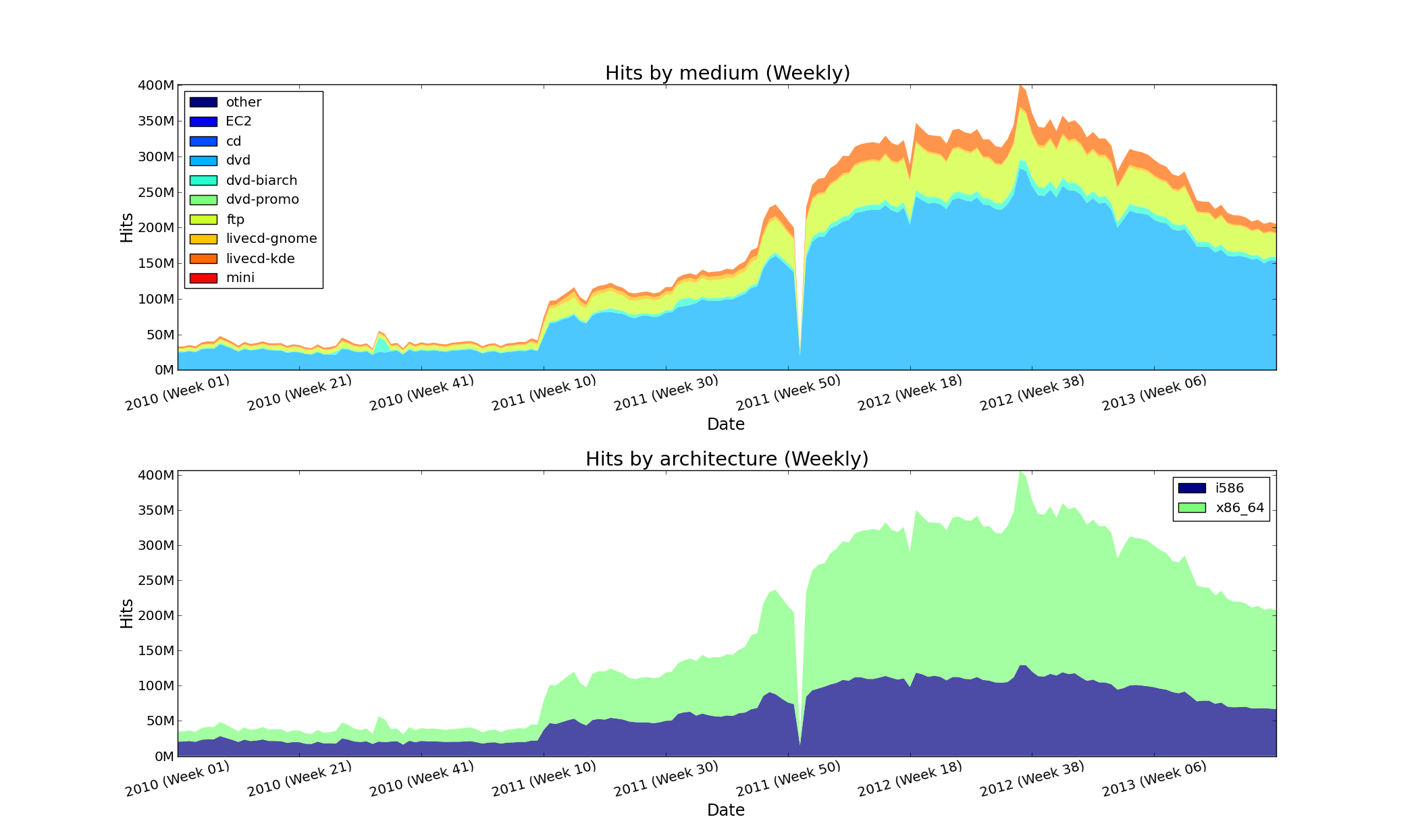
Medium and Architecture per week
The Open Build Service
The Open Build Service is what openSUSE uses to build and distribute packages. It is a very integral part of our infrastructure and how we work, and its server logs contain a wealth of information on the work done on openSUSE. For example, mining the list of Submit Requests that go into Factory and devel projects, we created the graph below to give an idea of the development of the number of contributors working on openSUSE, with the total (blue) per month going nicely up as you can see.

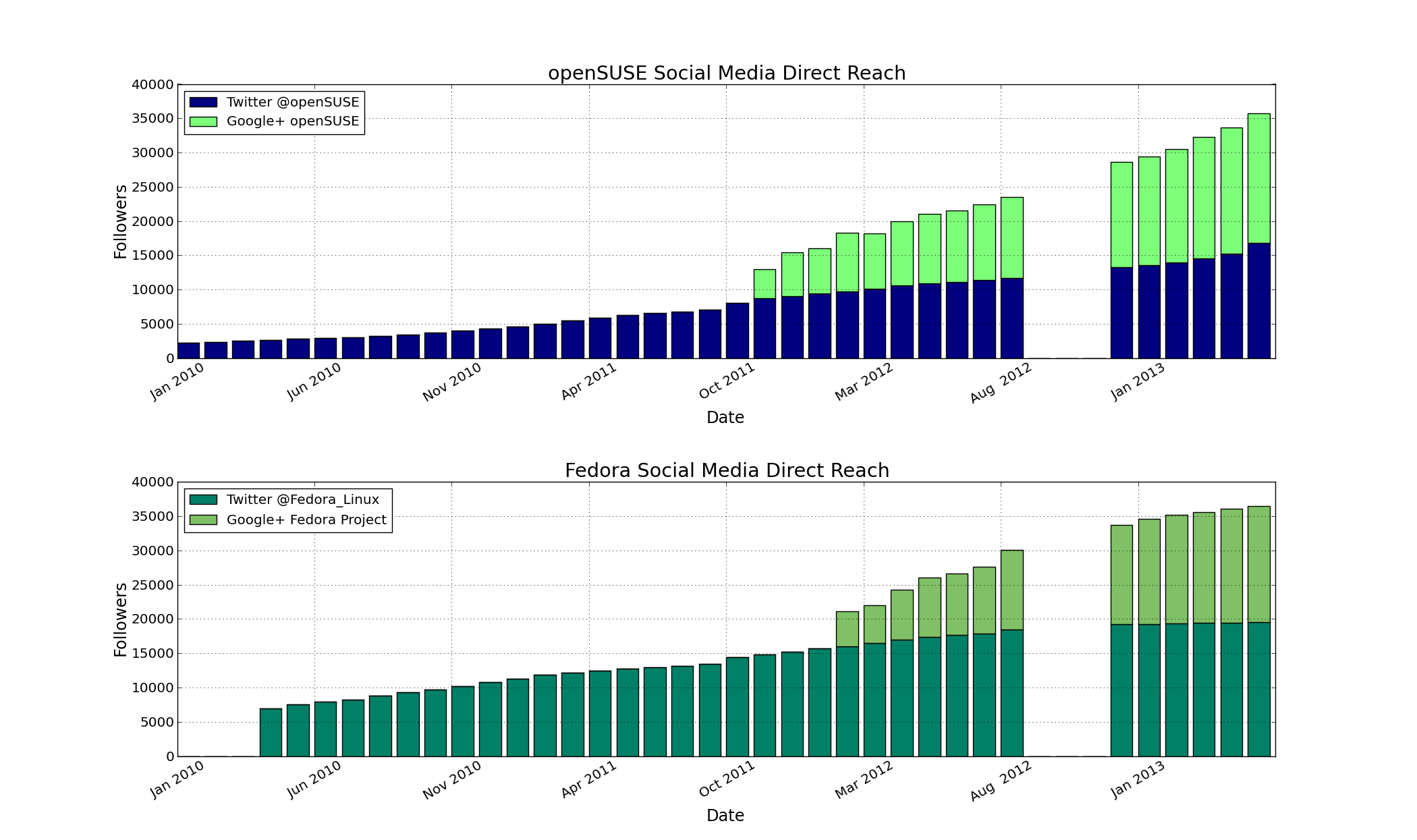
Social media
Thanks to the help of Athanasios-Ilias Rousinopoulos (that is a link to his presentation at oSC13) we’re regularly gathering statistics on our social media, a summary you can see in the graph below. Yes, we’re doing well getting our message to people, thank you all for your part in that!
Let’s compare: openSUSE vs. Fedora
Numbers are useless if you can’t compare. We searched for data from other distributions like Ubuntu, Gentoo, Arch or Debian, but only Fedora provides real numbers with the methodology used to generate them. Kudos to our friends at Fedora for being open and transparent!
Now, they use a different way of gathering data on downloads: counting the number of different IPs seen per day. To count users, they count the number of different IPs seen for this release since the release date. This complicated matters on our side but we’ve made it work. However, one variable was a bit harder: both distributions have different release cycles and dates. As you see in the graphs, we tried our best to make the comparison as direct as possible. The plots below are in the same scale of time and number of downloads.
openSUSE and Fedora Users
openSUSE and Fedora Downloads
As you can see, Fedora has more downloads than openSUSE. Looking at the users, the situation is reverse: openSUSE has quite a bit more users than Fedora according to this measurement. How is this possible? The explanation is most likely that most openSUSE users upgrade with a ‘zypper dup’ command to the new releases, while Fedora users tend to do a fresh installation. Note that, like everybody else, we’re very much aware of the deceptive nature of statistics: there is always room for mistakes in the analysis of data. To at least provide a way to detect errors and follow the commendable example set by Fedora, here are our data analysis scripts in github.

Contributor Statistics for week 33
All these statistics and still we’re not done! Here is the top-10 of contributors to Factory last week. As you can see, Stephan ‘Coolo’ Kulow is on vacation, freeing up a spot in the table 😉
| Spot | Name |
| 1 | Raymond Wooninck |
| 2 | Dominique Leuenberger |
| 3 | Sascha Peilicke |
| 4 | Hans-Peter Jansen |
| 5 | Bjørn Lie |
| 6 | Dirk Mueller |
| 7 | Ladislav Slezak |
| 8 | Ismail Donmez |
| 9 | Stefan Dirsch, Jan Engelhardt |
| 10 | Hrvoje Senjan |
Both comments and pings are currently closed.
The data show us only openSUSE and Fedora.
My friend Salih (he was also at the conference) wrote an article about what distro is the most famous. The article is in Greek but you can understand the graphs…
Check out here
http://cerebrux.net/erevna-pia-ine-i-dimofilesteri-dianomi-linux/
Keep in mind that what makes Mint special is, in the end, just the multimedia codecs. And the only reason they can ship them is because they are small. On openSUSE, people have to visit http://opensuse-community.org/Restricted_formats/12.3 and click the one-click-install to get the multimedia stuff. Extra work, for sure. But I’m not sure the attention and codecs translate in that many users.
It would be interesting if they would share stats though, maybe I am wrong.
Morning,
Can you describe how you mapped Fedora’s unique IP metric into your update usage metric or vice versa?
The article sort of brushes over that bit and I’d like a human language description of what the mapping was meant to do from the perspective of the people who did the implementation, before I go in and attempt to validate that the code does what is expected. I mean I know how I would do it, but I want to presuppose my preferred solution is what was used here.
-jef
Hi Jeff,
Quite easy: we used the exact same metrics. Aside from the more reliable metrics we have, we also can comb through our server logs like Fedora does and extract the IP addresses. As a matter of fact, that is what we used to do, see the link to http://en.opensuse.org/openSUSE:Statistics in the article.
So, there is no mapping needed, it is a straight comparison.
Cheers,
Jos