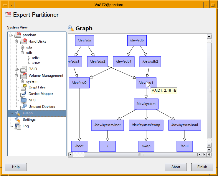
With openSUSE 11.1 on the road we developers can use some time for new ideas. One idea on my mind for month was to show the dependencies of storage devices in a graph. Using graphviz and QGraphicsScene a first version was running within few days.
It’s far from finished. Some items still missing are:
- Use different shapes and colors for different devices types.
- Some basic user-interaction.
Will be available in Factory within the next weeks. Further improvements are welcome.
Both comments and pings are currently closed.

This idea is great. I’m waitin’ for. 🙂
Great news. Waited for this feature for such a long time now.
Off topic from the article, what window manager are you using? TWM?
FVWM.
Frankly, it looks good, but it doesn’t add anything to what should be a tool for experts, where the look is the last aspect that counts. The partitioner should “just work” and correctly, because it is a delicate tool. Adding stuff like this is just making it bloated:
– It is unreadable during installation on small screens (netbooks anyone?).
– Accessing to devices options and editing functionalities is not intuitive because the side tree contains redundant information. Let’s explain: if you select the host name, you see a list of hard drives, but can’t edit them. Then you click on “Hard drives” and you still can select the hard drives and volumes but can’t edit them, then finally you expand the “Hard drives” trees you see the different physical devices and you finally can edit them. This part needs a lot of cleanup. 🙂
Please, do not answer this is the result of long usability tests. I know that already as it was discussed on IRC. But those usability studies are done proposing to users a pre-defined set of interfaces, and they just tell you which one is the best in the proposed set, which is a relative information. 😉
Regards,
A.
if you select the host name, you see a list of hard drives, but can’t edit them. Then you click on “Hard drives” and you still can select the hard drives and volumes but can’t edit them, then finally you expand the “Hard drives” trees you see the different physical devices and you finally can edit them
Just double-click (or press Enter if in ncurses) on the interface you want to edit. Simple as that 🙂 Is it really so little obvious?
That graph view looks pretty nice to get a quick overview if you have a complex setup involving many disks, raid & LVM. Congrats 🙂
On the other side I have to agree with Alberto that the current partitioner isn’t perfect because it requires quite some amount of clicking left and right to get stuff done – e.g. removing a partition from a LVM or editing partition properties. It would be great if this could be improved so it doesn’t require as many clicks and constant switching between the left & right menu part (e.g. clicking on something in your graph view should get one directly to the appropriate edit dialog).
Also I really really hope you finally add the ability to install onto an encrypted root filesystem in time for 11.2. Please 😀
Wow