After releasing WebYaST 1.0 last week we have had a look to the status module again and have come to the conclusion that we can do it better. 🙂
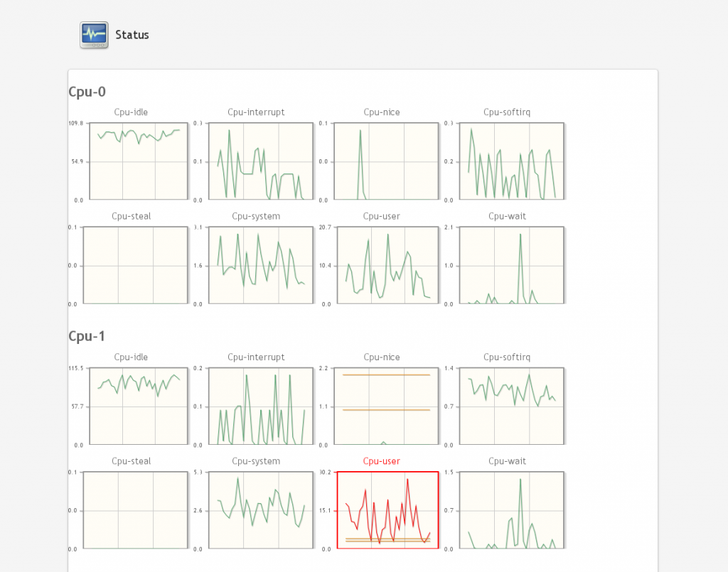
The current version looks more like a medical monitoring system that no one understand:
Technical background
The system data will be collected by a service called collectd (www.collectd.org). This data will be stored in a rrd-database which is located in
/var/lib/collectd/<system-name>/[cpu-0|cpu-1|df|interface|load|memory|….]
An own file/database will for each value will be generated.
The upper screen shot shows that an own graphic will be shown for each value. This is not really user friendly. We would like to show only values which provides “really” interesting information for the sysadmin or user. These values should also be grouped in order to reduce the amount of graphs.
Another lack of information is the labeling of the graphs. There is no description what the values mean and in which period they have been evaluated.
The aim
would be to give the user a nice overview about the system status. Additional, there should be an alarm system available if system values are exceeded. E.g. there should be sent an email to the system administrator if no disk space is available anymore.
The Administrator should also be able to configure “his” needed system values in a nice way.
Suggestion for configuration
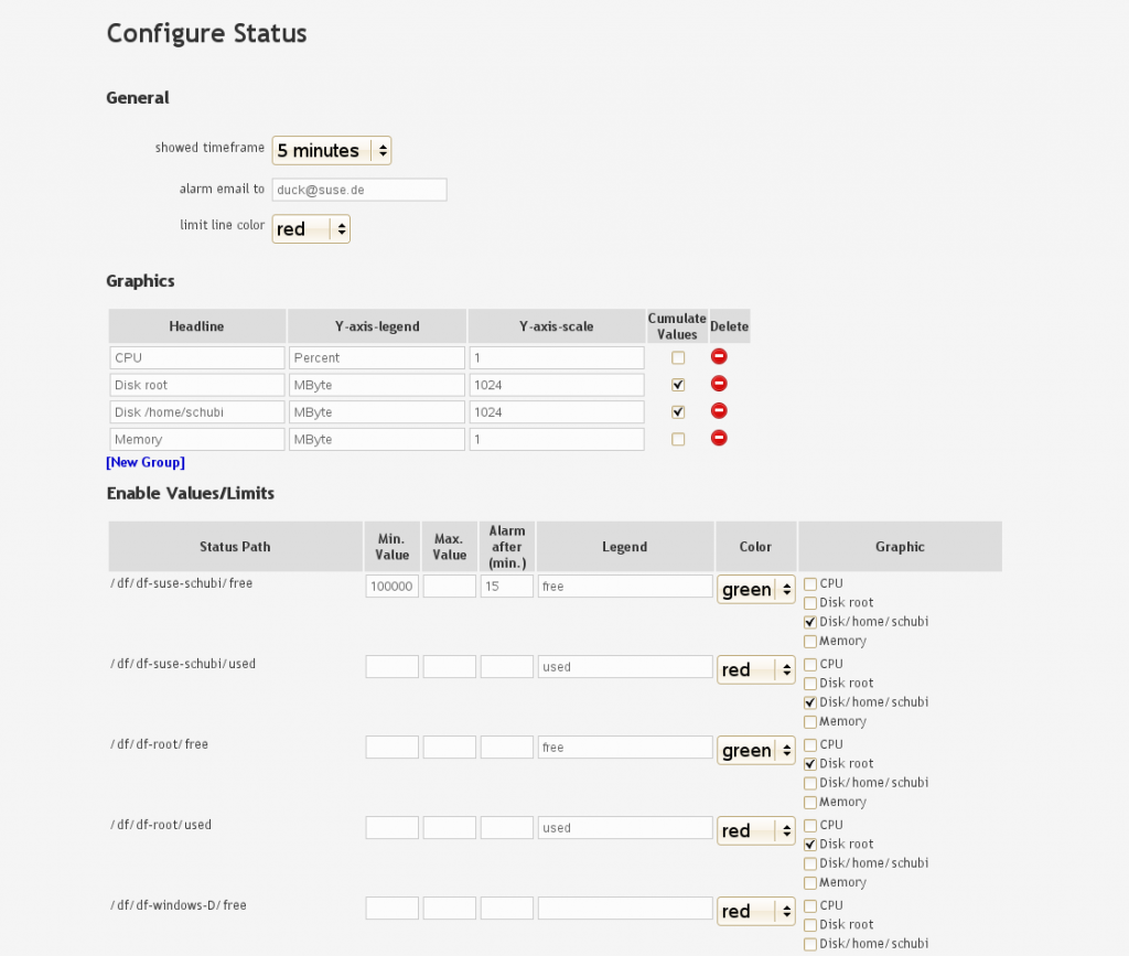
There are three parts:
- General
General setting like period time of shown data, email address in the case of occurred errors and the color of displayed limits. - Graphics
Defining graphs with- labels
- scales
- flag for cumulate values
This means that the values in the graph are added. E.g. the component df of collectd returns two values of a partition (free, used). These values will be cumulated in the graph like this:
- Enable Values/Limits
- Defining which data of collectd will be shown in the graphics described above. This enable us to group data in one graph, defining color and label of each collectd value:
- Defining limits and send an email if the value is overstepped longer than the defined period (Alarm after (min.))
- Defining which data of collectd will be shown in the graphics described above. This enable us to group data in one graph, defining color and label of each collectd value:


The Result
should be an amount of view graphs which include interesting data only. These values are checked periodically and an email will be sent if they exceed a defined limit.
I am asking for
your opinion about:
- Do you know a much more fancy way for displaying system status data ?
- Which kind of Data would be interesting for you (CPU, memory, disk-space,….)?
- When and for which kind of data would you like to get an email if limits have been exceeded?
So, before changing this module we would like to ask you what you would like to see. 🙂
Thanks in advance.
Both comments and pings are currently closed.
Hi, few notes (just how I see it).
1) try avoid showing implementation details or unnecessary details this is:
a) showed timeframe – it is not clear for me, if this mean how often check system or how much data is shown in graph ( of course I know right answer, but it is confusing)
b) Y-axis-legend – too much technical, I think that it doesn’t change units, so simple checkbox show axis units is enough
c) Y-axis-scale – again too much technical or mathematics. simple values range is enough (and allow easy to enable automatic range, which is what almost everyone want)
d) limits part is completely confusing – Status path – who care about collectd path? I think it need some user friendly transformation like “free space on disc-schubi”. Missing units at minimal and maximal value (also helper to specify easy big values should be useful). Legend row is confusing for me, what legend it is and also initial values doesn’t look like good one for me (better is same as I recommend in status path replace). Color is which color? Also cumulative value looks little magic for me. I also don’t understand what mean row graphic? What happen if I specify cpu usage for free space on schubi? that lead to second note.
2) try decrease complexity of configuration. If this whole page is showed to me I can choose two things – read manual or go away, because it is too complex. I recommend to have each part hidden except general. So when page is open you have simple three options and if you want more tune status, then you can click on tittle and finer tunning is showed. Also show only reasonable options. Less options is better 😉
3) icon for delete is not sufficient. I think that simple red X is better.
4) instead combobox of names of color place few squares in line and click on square with color choose color, it is more user friendly.
It improves status page, but there is still space to improve it.
Thanks for the reply. But more interesting would be which data has to be shown in the graphs (CPU, DF,…) and how this data should be shown.
Do you have some opinions here too ?
The configuration is more or less a second issue. Thats my fault I should have made this more clear.
If I have server (or appliance which is used as server) then I want to see disc usage, peeks in memory and CPU (to see if new memory is required or when schedule regular tasks), statisics about used software (I know that it is hard…e.g. database, apache etc) (I am not admin, so I don’t know what is interesting thing in that statictics).
so to summary:
disc usage – showed graph is good
cpu and memory peeks – showed graph is good, but maybe more scaling should be available (to see changes during one day, one week and maybe also during one year)
software statistics – no idea how it should look like (at least a downtime or average response should be good)
hardware vitality – don’t show by default, but if go near critical value show it ( e.g. if you have 4disc raid and one disc fail, or if SMART report problem, or critical temperature etc.)..but don’t show status by default – you don’t care if everything work as expected 😉
Hi Stefan,
It’s great that you’re looking into changing the status information page of webyast!
However, you should think about presenting the most important information quickly and clearly. It’s far more important than configurability.
Taking as much information as possible, throwing it at a person using your software, and forcing them to decide what to do is a HUGE disservice to the person who uses the software. As developers, we need to do the hard work of thinking of what is important, and presenting it in a nice, coherent, understandable way.
In addition, adding configurability means adding much more complication, including odd interactions, and more code to support.
Of course, at some point in time, some ability to customize the view may be nice, but it could possibly be integrated, or might scale with what other options are selected in webyast. (Such as seeing webserver health only if a webserver is installed and configured, for example.)
Errors, warnings, and notifications should take center stage. They should be the first thing you see, at the top. If there’s a problem with the system, or there is some vital information, you need to know what it is. There should also be some way to easily fix the error too — it would be best if it was a one-click option to fix the issue, but even providing human-friendly text about what is going on and a link to easy-to-read documentation on how to fix it would be decent.
Charts and graphs are nice, but there shouldn’t be too many, for a few different reasons: First of all, they add clutter to the page, making it harder to find a tiny needle of important information in a huge haystack of information noise. Secondly, since this is browser based, it’s important to note that you should consider certain browsers which will take a performance hit by having so many rich graph elements on one page. (Sure there are ways to optimize, and designs shouldn’t necessarily be limited by technical issues, but should drive solutions… but the reality is that if you’re supporting Internet Explorer, it’s a known issue. Again, there are some workarounds, but since the easy solution (have fewer graphs in total, such as combining multiple CPU cores into one graph instead of one per core) would help out with performance AND understandability… it’s a clear win.)
Also consider the colors. You should use pleasing colors (such as the Tango palette), and make sure you test it with colorblind people too.
Overall, remember that there is a TON of information you can show here — but you have to ask yourself, “What is the goal of this page?” Simply put, the goal is to have a clear overview of the most important, relevant system events. Anything that doesn’t fit into that goal (such as if it is not actually useful information, or the configuration of mountains of amounts of data, as shown in the screenshots) should not be part of the interface. Often, I find it helpful to step away from the computer and do things like think about the interface, brainstorm, take notes, talk with others, and try to really think about the problems. It’s fine to sketch out the important parts on paper; you can make a really rough outline of the important information, and feel free to make many sketches… You can use the sketches to talk with others to find out what they think too. (And you can even sketch with others as well.) Iterating with quick sketches on paper is almost always quicker & easier than doing it in code.
Simplicity has many benefits. Not only does it make things easier to understand for those using the software, it makes it easier to develop, test, bugfix, and maintain. It also allows you to spend more time on making sure the implementation is good and solid.
I’m really happy that you are excited about making webyast better. It’s also good that you’re looking for help to improve it. I hope that this input that I’ve provided has been insightful in some way. Webyast has a really promising future, and I think we’re all looking forward to it! Thanks for all your effort in helping to build it. (:
Thanks for bringing up this topic!
As discussed my proposals are:
For the overview of system status
The main idea was to show an overview of system component status (e.g. CPU) indicated e.g. by a green dot (or something)
After clicking on the section an accordion opens with detailled information and a graph.
The limits are edited via >Settings. The settings are organized in tabs.
The user selects and
For system specific limits the user selects whether he wants to be informed if a certain value is either undercut or exceeded.
Hi, I personally prefer hiding of options instead using tabs. If user starts with configuration and see that there is four tabs he could be scared. If he see easy to understand general settings and three details link (which show details on request ( using +/- to show/hide)) then he know what is important to set and what is just for experts. (just my opinion as non-usability-expert)