There are many approaches to managing software packages. Some users like to use command line tools like zypper. Others prefer a GUI tool like the YaST2 package selector. And even within such a GUI tool, there are many ways to deal with the packages you’d like to install, update or remove: Install a bunch of packages that make up a functionality like “KDE desktop” or “web development”, find one specific package with a known name, or just look through packages that are available. That’s why there are different filter views for those different approaches.
How do you select any of those filter views? In previous versions of the (Qt) package selector, we used to have a combo box to do that:
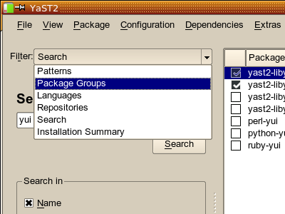
That’s somewhat unusual, and there have always been critics who claimed that we should use tabs instead. Our standard reply was always that this would not really be helpful because there are so many of them; you’d run out of screen space quickly, and with the number of filter views we have, this would look overwhelming and confusing:

Ugh… not good. Not even at this screen resolution. Now think about 800×480 netbooks and more verbose languages like German, French or Hungarian. No way to make this fit on the screen. And left/right scroll buttons are the last thing you want for tabs.
So, what else could we do?
Reduce the number of filter views? Well, we’ve been down that road for a while. But new ones come along all the time, and it always hurts some users when we throw out their favourite one. The “RPM groups” (the one with a tree) was such a case; it had to make way for the newer PackageKit groups. A number of users complained.
And we have more filter views in store. There are many more cool things we could do. But this should not add to confusion, so right now, we avoid to add more views.
But how is everybody else doing it? Let’s have a few looks at that.
What is it we are doing here? We are browsing for and through packages. So, let’s compare it with other kinds of browsers. Let’s look at Konqueror:
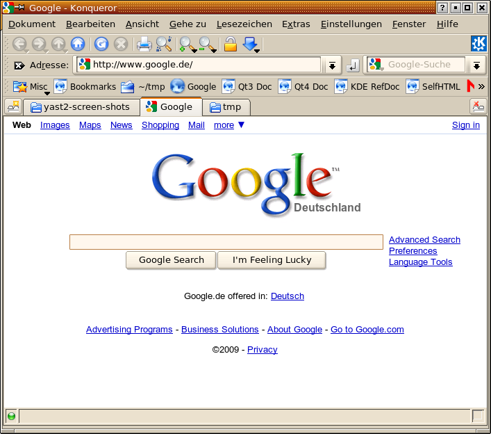
In Konqueror, you can use tabs. Once you got used to it, that’s a powerful and efficient way to avoid cluttering your screen with multiple browser windows. They are all neatly tucked away in that row of tabs.
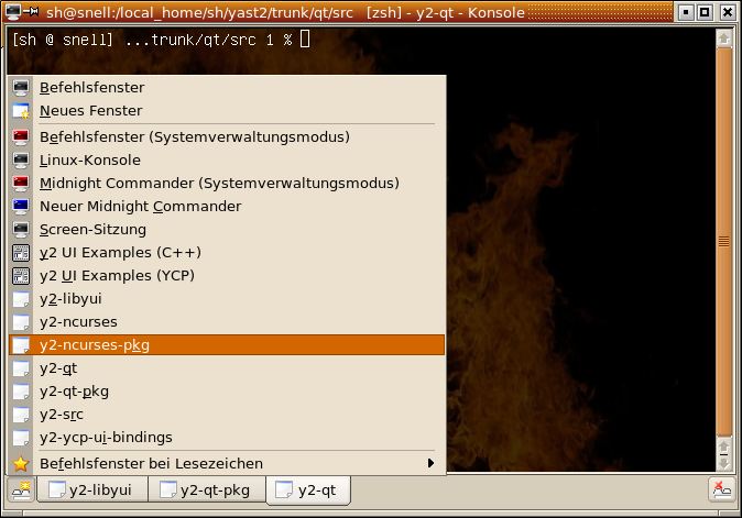
Another application that uses a similar approach is Konsole, the KDE terminal emulator:

While in Konqueror you use the middle mouse button to open a link or a bookmark in a new tab, there is a limited number of options in Konsole. You select a session type from a pop-up menu on a special button on the bottom left corner:
So, let’s try someting similar with the YaST2 Qt package selector. Let’s try to use tabs, but not in an overwhelming number. Let’s open only a few of them right away. The user can open more if he likes.
First try:
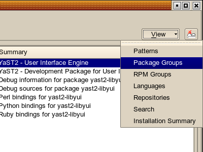
Hm – or maybe put that “View” button in the top left corner?

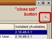
Of course, the user can close any of the open tabs (except the last one) again – just like in Konqueror or in Konsole:
If we really do that, that means that the door is now no longer closed for new filter views. Some that could be added immediately are:
- Show all available (not installed) packages (yes, available via “Installation Summary”, but not that obvious to novice users)
- Show all installed packages (also available via “Installation Summary”)
- Keywords / tag cloud (“KDE application” (linked against KDE libs), “GNOME application”, “mail client”, “Java application”)
We don’t want to overdo it, of course.
So… what do you out there think? Do you like it? Should we use tabs there? If yes, where to put that “View” menu? Left? Right? Elsewhere? Use a toolbar button with just an icon (like in Konsole) instead? Add it to the main menu, too?
Comments? (on topic please, there are other tools and forums for support or bug reports)
Both comments and pings are currently closed.
No. There is no logic to use tabs in software management. It’s linear process, not parallel
I like the idea to rework it but tabs don’t sound really right for that =/ You do tabs to return to another issue and keep doing the current thing
I would prefer the left side beeing filled with options (big buttons) like search, update, etc and after clicking going into that step, when done you can press “back” of the bottom of the right side to return to the selection menu. (similar to the K or Gnome Menu without sliding
Which part of the dialog would you be willing to sacrifice for those big buttons? Remember that in many cases the dialog will be full screen, so simply adding more stuff at any side will always mean sacrificing screen space that is currently used for something else.
Tabs NO! As Dani said: It’s linear process, not parallel.
But, PLEASE, PLEASE, don’t close yast after install/update/delete is complete… in 11.0 and older you had a dialog pop up at the end asking me if I want to install more packages. Make that feature came back. It’s a pain to always have to reopen yast, because I usually don’t do everything in one go…
That feature is back in Factory since last week, in even better and more flexible way, since it is now configurable what pkg manager will do at the end: http://lists.opensuse.org/opensuse-factory/2009-01/msg00492.html
In fact, not only in Factory, there is some 11.1 version available in lslezak’s OBS home
I do like it.
At this moment there is a difference in the KDE and the GNOME way of doing things. In GNOME when you filter Package Groups, you can go into detail much more. Something that is not possible in KDE when you only see e.g. Games.
I also agree about not closing YaST. In fact I would like to see a summery after installation. Now I have often no idea what exactly happened.
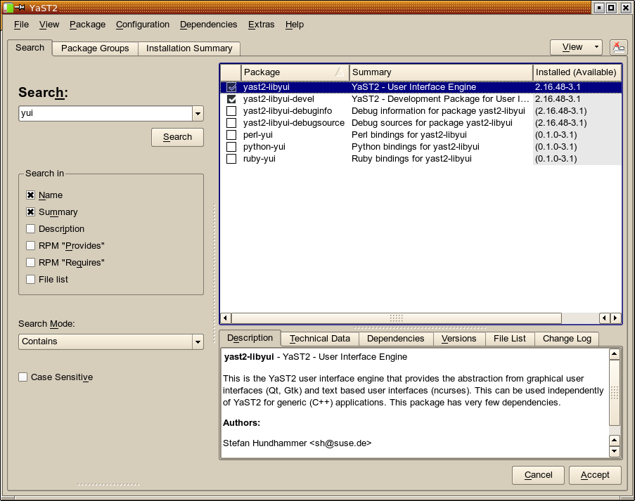
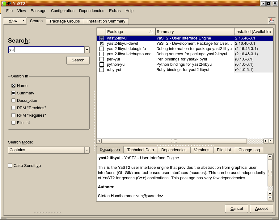
That’s the difference between the PackageKit package groups (a flat list) and the RPM group tags (a tree) that I mentioned. That one is already back in that prototype – see the screenshots above with the “View” pop-up menu. You’ll see “Package Groups” there (the flat PackageKit groups list) as well as “RPM Groups” (the old tree).
Tabs are a nice idea, but ONLY IF the list-views are remembered and updated in parallel. Then it would be nice to switch fast between different selections. And it should not be so hard, to notify the other open tab-views about changes in other views, if affected.
I like it also. One view that I haven’t yet been able to get is to show only packages for which upgrades are available i.e. where available version > installed version (maybe I just haven’t looked or tried hard enough). I agree that tabs would make it easier to switch between different view and since each view is looking at the same underlying data there should be no problems with views getting out of sync (they don’t now if you switch between filters so why should tabbed access to the filters make any difference?).
Incidentally, would it make it easier to define new views if Yast2 used something like SQLite or mysqle as a backend? Then filters/views could be constructed as sql queries which would add considerable flexibility to how the data is displayed. Custom filters/queries could then be user-defined if the user so desired.
I’m thinking of a commercial application that I use fairly regularly for managing the configuration of a video matrix switch. The configuration files are stored as flat files on the disk but when the configurator is run the data is read and inserted into an sql database which then is used for editing. On save the data is dumped from the database back to the configuration files.
It should be possible to do something similar here where Yast2 inserts the package/repository data into an sql database on start, uses that data to present the views etc. to the user and then writes the changed data back to the repository cache files when finished.
OK, I realise that that is probably outside the scope of the existing discussion (for which I apologise) but it was just a thought that occurred to me as I was pondering on the original question.
“Incidentially” means “I am now beginning to talk about something completely else”, right? 😉
Still…
Somebody else had proposed that with similar arguments, and we had done that for openSUSE-10.2. It was a major disaster. Getting rid of that incredibly slow sqlite for openSUSE-11.0 brought a 1000% (factor 10) performance gain.
Plus, considering the complexity of the subject, do you really think it’s a good idea to let users manipulate the package data without any kind of sanity check (dependency resolving!) ? This would be a whole lot of accidents waiting to happen.
Amazing! Much better than the current dropdown solution! Also makes switching groups now only one click instead of two clicks. If this mockup comes true, you proved once more that my choice for the yast package manager was the right one!
LOL, that is not a mockup! Stefan actually compiled before taking the screenshot. That prototype is real.
1. I think the IDEA of TABS is great, but …. it would be much butter to use tabs for:
SEARCH
INSTALLED
UNINSTALLED
INSTALLATION SUMMARY
And the view for “Package groups” etc. should be in the VIEW in the menu.
2. There should be also added information in INSTALLATOIN SUMMARY how mucht space will be spared or used after the installation/deinstallation and how mutch kBs/MBs will be dwonloaded if the INTERNET repositories will be used.
3. There should be added a FILTER (as a EDITBOX, always visible) that in REAL TIME it filtering the listed packages – the same idea has DOLPHIN in KDE. This is very desired option, not also because “Rodney” has right with search queries but sometimes there is just to mutch founded RPM’s in the list.
It might be useful to take this a little further if possible. Instead of there being tabs, would it not help to have a file-browser kind of approach? For example in dolphin we have view by Icons, details, columns on the toolbar, similarly we could have a toolbar in YAST with the relevant view by Patterns, Package groups, Installed, etc. Further the toolbar could have additional buttons depending on context. For example when the view by Patterns is selected, there could be buttons for install entire pattern, uninstall pattern, etc. The install package and uninstall package buttons should be shown in the toolbar for all views. Additionally dolphin has a column view that expands when a certain directory is selected to show its children. This could be a useful view for package groups.
In any case the tabs feature also looks great, just that it gives the feeling of parallel working, which the package manager does not.
I think I know what you mean. But look at the screen shots: Right now we have 7 different views already, not counting new ones or more exotic ones like “update problems” or even just “patches”. In the model you suggested, that would correspond to 7-9 toolbar buttons. Would it be possible to find icons for each of them that are self-explanatory for most users – or that users could even just remember? I have doubts. So there would have to be a textual description for each one, too. If there is only a text or an icon with a text right beside it, it would consume exactly as much screen space as the “all tabs shown” screenshot above, and it would suffer from the same problem: Overwhelming, intimidating, confusing. If we’d rely on pure icon toolbar buttons with tooltips, most users would have to wait for the tooltip to appear for each mouse movement – because the icons (in particular, in the size a toolbar button mandates) would not be enough information. I fear that most of those icons would just be colorful heaps of pixels.
The difference to a file browser is that for a file browser there are (a) much fewer icons (much fewer views) and (b) the icon can be a miniature visual representation of what the user will get. Both points don’t apply here IMHO.
Couldn’t agree with you more. But we could also have the toolbar show only 3 (or whatever the number of default tabs to show is) tabs and have a button for additional views (a drop-down just like the one you have in the current implementation). The advantage with the toolbar would be that you could implement other buttons (like I mentioned buttons for install pattern, uninstall pattern, etc.) context-sensitively (depending on which tab is active) to functions that in the current implementation require a (non-intuitive) right click. Just read your follow-up too, and very glad to know that this is going into factory soon. Any plans for back-porting this to 11.1 when it is ready, so that people could test this out for usability without having to use a factory OS?
Wow, I really like the idea of showing a few most-used filter views and opening new tab on demand. And, of course, closing it when I no longer need it (or when the screen space runs out). This was something I really loved on KDE3 Konsole – new tab “opener” on the left edge, tab closing button on the right edge. Please keep the tab closing button at least (I was really disappointed to see that KDE4 Konsole made opening and closing new tabs much more difficult).
This is still possible with KDE4 Konsole but a little bit hidden. You can enable the buttons, when you edit your profile in the subwindow tab.
+1 for using tabs in YaST – even if I like to see the ncurses screenshots before I make my final decision 😉
I liked the RPM-Groups view in the past – and hopefully this is a chance to get it back. Other people might have other preferenced views – they should be stored between the sessions.
Thinking about my current “main usage” of the sw_single module is searching for a special package. So I like to vote for a general available search box (like the addressfield in konqui) – perhaps in the top beside the “view” drop-down box? Perhaps such a textbox can also be used in combination with the “view” drop-down box…(no final idea, just a innovation impulse 😉 ?
No change for the NCurses version for this: The NCurses package selector is an independent piece of code. We had done that years ago (for SuSE Linux 8.2 IIRC) so we don’t have to get down to the least common denominator for everything we do. Package management is just too complex for the generic (and thus simple) widget set we use elsewhere in YaST2.
actually, i liked the old way best.