In last Friday’s blog entry about tabbed browsing for packages, I had asked for comments and opinions. There were quite a number of them, all of them very constructive. Thanks to all who participated!
The overall feedback was positive, welcoming the change. To us, this means that we will indeed merge that code branch (yes, it’s largely working already, it’s not just a mock-up) to the main development line, and you will see that new user interface appear in the next versions of the yast2-qt-pkg package on FACTORY.
There were a number of concerns and side issues that I’d like to summarize here:
- We should not use tabs here because what goes on is not parallel. Well, this is an issue that could be debated for a long time. It’s not parallel in the same sense as multiple sessions in separate KDE konsole tabs. But it’s at least as parallel as different settings in settings dialogs in a zillion of applications: More or less unrelated stuff that would clutter the screen too much if displayed all at ounce, but that makes sense to be grouped together. In tabs. We do respect others seeing this differently, but weighing the pros and cons carefully we found that this rather abstract concern does not outweigh the benefit of migrating to tabs.
- Missing keyboard shortcuts. Right: Each tab and each menu entry should have one. I added them to the code this afternoon.
- Duplicate View menu, one in the main menu bar and on that new View button. That was an oversight; the label on that button was New in the first version, but that didn’t look too obvious to us, so we changed it to View, not realizing that we already had a View menu in the main menu bar. That menu in the main menu bar contained view options, so it is now renamed to Options and moved to the right. It’s not truly a traditional View menu anyway. It contains menu entries like Show -devel Packages and Show -debuginfo Packages.
- Consuming screen space for the tabs. Right, this is a tradeoff.
- Less surprise to first time users. That combo box was unusual, and some of you replied that they had to point first time openSUSE users to that combo box so they could switch views.
- Don’t change for the sake of changing. No, we are not doing that. You’d be amazed how many times we had to defend our design. There were a number of attempts to radically dumb it down for the sake of newbies, but the voice of reason had always won. The world does not consist of newbies only. We also have to cater for expert or intermediate users. We came up with the simple Patterns dialog during installation for them, moving the full-fledged package selector one more mouse click away (with the Details button) for the experts. Each time we improve the usability of the package selector, there is one less arguments for dumbing it down. We believe that using tabs is a step towards that direction.
- Nobody commented on the position of that View button. The majority of internal people here (including our usability experts) said they preferred it on the left side where it isn’t easily overlooked (unlike on the right side).
- The current settings (which tabs are open) should be saved upon exit and restored when the user enters the dialog the next time. I hadn’t explicitly mentioned this, but this was always our intention. It’s not in the code yet, but this is the next thing on the “to do” list.
There were also some side issues that were not entirely on topic, yet worthwhile to mention:
- Don’t quit the package management workflow after package installation is finished. There was a long discussion about that in Bugzilla why that “Install more packages?” pop-up was introduced in the first place (because of slow start-up times of the package management stack) and why we removed it when that was no longer the case. For those of you who want that question pop-up back, look here how.
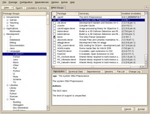
- Some users complained that the new flat list in the Package Groups filter view is confusing – too many packages are listed in each category. They want the old tree back. Well, here it is – it’s the RPM Groups filter view I had briefly mentioned:

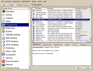
The other view (the flat PackageKit groups list) is still there, of course:
Both comments and pings are currently closed.


Looking better and better, all that’s missing is a tab where you can enable and disable repositories without entering repository manager.
Hmm, how would you want to do that, without making the repository filter view look even more cluttered and uselessly complex? The only feasible solution I can think of is to have right-click context menu for repository list items (with options enable/disable, autorefresh on/off for this repository )
Thanks Stefan! Firstly for providing the tree back, I found the flat structure a draw back due to the vastly increased scrolling.
Secondly for engaging in an RFC type process. Hopefully such engagement can prevent misleading options be presented to a user, without enforced “dumbing down” frustrating power-users who know exactly what they want.