So I’m still running openSUSE 10.3 as my main desktop, and will be until next week when the pre-ordered boxed editions are supposed to ship. By then I’ll be able to do a full review of what I think about openSUSE 11.0, but I did download and install the GNOME Live CD yesterday, and so I wanted to just talk about a few points, good and bad.
Keep in mind, this is just me using this system for a few hours, and just talking about a few key points. If you’ve got comments about something I’ve said, please comment 😉
The Good
The art and look & feel of openSUSE 11.0 rocks! I really like the new GTK theme for the GNOME desktop, which gies the system a much needed refresh of the theme.
I also liked the GNOME live installer. Although it’s not the widely loved new installer from the DVD (which I’ll finally be able to use next week), it does look nice and do it’s job well. Unfortunately, it doesn’t have the world map included in the install, apparently it was included in response to a bug I filed in a late beta but came in too late for 11.0.
After the install and the reboot, I was brought to the login manager. It wasn’t the new login manager included in GNOME 2.22, but the older one. It still works, but I think in this day and age it’s time for people to be able to have a face browser. You know, 9 years after Mac OS 9 and Windows XP both included them.
On the desktop, I was shown the Greeter and a window asking for me to perform an online update. At the same time. Neither of which helped me, considering I have no internet access until I install the Madwifi driver. But if both windows are going to be shown at the same time, they should be a part of the same window, e.g. the user clicks out of the greeter, then the online update request is shown.
Setting up the online update was easy enough, although it still took a while. More on the online updating situation in the “The Bad” section below.
This was about the extention of the little playing around I did, so without further adieu…
The Bad
Yes, boo me if you will, but I unfortunatly found that the GNOME desktop seemed to regress in the polish department. The online update/greeter thing as mentioned earlier was one thing, but there are several other issues I have with 11.0. These may seem nit-picky, but these are things reviewers and users will take away from the system.
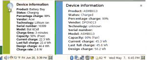
The first issue I noticed is something I filed a bug report about in 11.0, and that was the notification messages. They are over sized, obnoxious, and don’t fit in with the look and feel of openSUSE 11.0. For one, that little stripe is blue. 11.0 is green. Not a match, the board goes back. And it’s not even the shade of blue that matches the window decorations or the theme. And they are way too big. You can see the same message in 10.3 and 11.0, and the color and size difference. Worse than that, some applications change the color of the stripe for no apparent reason. NetworkManager is one, it makes it dark blue. PackageKit is another, making it this ugly shade of red. I’m sorry, this just doesn’t look professional to me.
Left is 10.3, Right is 11.0

Next, on the menu, is a button under Control Center for YaST. I don’t know when this was put in, but it had to have been late. It wasn’t in the last public release candidate, but it was snuck in in the later ones before gold, apparently. And it was a bad choice, considering YaST is already accessable from the Control Center. And it actually says YaST. Call me crazy, but if I’m a user looking to set up a new user, I’m probably not going to think, “well, I need to look for something called YaST”. Calling it Administrator Settings, as it was in 10.2 and 10.3 would work great. But it isn’t.
And another issue, in the Control Center, all but two of the Common Tasks are missing. And, the Show Administrator Settings (aka YaST) is missing. Meaning nowhere on the desktop is YaST referred to as anything but YaST. Bug report.
The 3D settings. I’m not sure making AIGLX default, and then not providing a way to switch on XGL for those people who AIGLX isn’t faster for, was the best option. Desktop Effects on my Intel graphics chip on 11.0 is really slow. Going into the console and switching on XGL works, but is that what you want to tell a new user who wants effects to actually work on his or her system to do?
Before I get to the big finish, I wanted to say: would it seriously have been a huge hit to the 11.0 development cycle to include at least a release candidate of Firefox 3, instead of Beta 5?
And finally, PackageKit. I’ve only used it a little, but I’m not a fan. Personally, I liked the GNOME openSUSE Updater from openSUSE 10.3, and with just a few improvements (such as showing what the updates are and allowing users to select or deselect them without loading up the YaST module), would have been a fine addition to 11.0. But instead, we’re using PackageKit’s updater, which is annoying and obnoxious, at least the time I used it. After getting online update set up, I get this blaring giant red notification message about 1 security update. I have the option of choosing to update it with a click of the button on the screen, so I click it. Then the root password dialog comes up, and after that another notification, this time in blue, comes up letting me know my system is being updated. After a minute, I get another notification, telling me it’s done. The icon goes away, I assume it’s finished. Then I try going into the Install Software, and I get a message that something else is accessing package management. What else is it? Well, PackageKit still has control over it, although it doesn’t tell me. At least with the openSUSE updater, you can see when it’s doing something.
I don’t see the value add for PackageKit vs. our own updater. Unless this is all about being as close to possible to GNOME upstream, in which case I don’t think that’s a case for which we need to be degrading user experiance. It is a desktop enviroment, we are supposed to be free to change it in whichever way we would like to make it better, and more openSUSE-ish. And although I’m reserving full judgement on openSUSE 11.0 GNOME until I get the full edition and live with it for a few days, I’m unfortunately not that impressed with it as of yet.
